“COVID-19 hospitalizations continue to rise as NC corrects technical issue with reporting system,” blared WTVD on Twitter earlier today. Worrisome, isn’t it?
This is an odd headline considering the fact that daily COVID-19 hospitalizations have been below 1,000 for 15 days in a row. In fact, you’ve probably never even heard that hospitalizations have been trending downward the past few weeks. Media aren’t going to tell you; doing so wouldn’t keep you properly terrified.
But as I wrote on June 19:
Unless you are in possession of a memory, you forgot that the best-case scenario was that we’d have a small peak of hospitalizations not in April, not even in May, but in July.
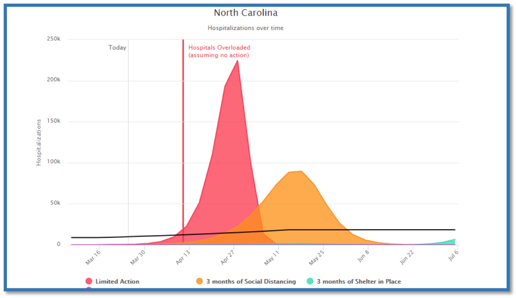
That best-case scenario was presented by representatives of the North Carolina Medical Society (NCMS) to the General Assembly’s House Select Committee on COVID-19 on March 26, the day before Gov. Roy Cooper dropped his stay-at-home executive order. The committee heard testimony from NCMA representatives, who presented the General Assembly with a report on “COVID-19: Analysis and Response.”
In her testimony, NCMS board member and Duke University professor Dr. Eileen Raynor highlighted a graph from that report with three projected hospitalization curves through July 6.
I have updated the NCMS graph to reflect the actual hospitalizations data (7-day rolling average) through today, September 10. Click here for the full size of this chart:

Because it’s very difficult to see NC’s actual hospitalizations curve on that chart, owing to the enormous scale of its y-axis, I’ve isolated it with a y-axis based on the NC Medical Society’s estimated July 6 peak of around 12,000 hospitalizations. It’s the chart atop this post.
The peak 7-day rolling average of hospitalizations occurred on July 31 at 1,177.6 — about one-tenth of the NC Medical Society’s best-case scenario. The single-day peak was 1,236 on July 29.


