Because the U.S. House, Senate, and president all have taken the now rare step of releasing budget plans, it’s possible to compare their competing proposals. Kevin Hassett of the American Enterprise Institute does just that in a new National Review Online column, offering brief commentary and some interesting charts.
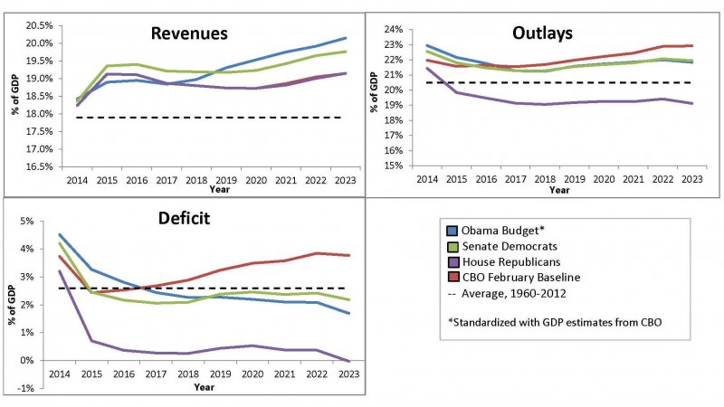
First, let’s look at revenues. The Republicans’ position is that they agreed to a large tax increase at the start of the year, and they are done with tax increases. Revenues in their budget are identical to the baseline. Senate Democrats call for higher tax revenues immediately, through limiting deductions and tax expenditures (although they leave it to the Senate Finance Committee to come up with the details of how $975 billion would be raised over ten years). President Obama increases tax revenues through a number of measures, including limiting itemized deductions for high-income earners and imposing a baseline tax amount of 30 percent on people earning over a million dollars, but these phase up more gradually than in the Senate plan.
On spending, the CBO baseline calls for outlays to rise from about 22 percent of GDP to about 23 percent over the next ten years. The House budget would cut that sharply, down to about 19 percent by the end of the decade. Both the Senate Democratic plan and the Obama plan call for much higher outlays at the outset, with Obama increasing spending in 2014 by a full 1 percent of GDP, and both promise to be virtuous in the out years, with future virtue having about the same scale as current sinfulness, albeit less plausibly.
The first two charts reveal relatively large differences, so it should be no surprise that the deficit impacts are wildly different. The Republican plan achieves balance by the end of the decade, whereas the two Democratic entries converge to deficits in the neighborhood of 2 percent.