“NC sets new COVID-19 hospitalizations record for the 10th time in June,” warned ABC 11 News yesterday. A tenth record this month means we’ve seen lots of these fear-triggering headlines.
Last week, as North Carolina set a now-eclipsed record for COVID-19 hospitalizations, N.C. Secretary of Health and Human Services Dr. Mandy Cohen told NPR that “we are concerned” and raised the possibility of ordering people “back to stay-at-home” again.
What’s going on? Is the state spiraling out of control?
No. Precisely the opposite. In fact, this was part of the Cooper administration and North Carolina health care establishment’s plan to flatten the curve of hospitalizations.
A July peak of hospitalizations was what they hoped for
Unless you are in possession of a memory, you forgot that the best-case scenario was that we’d have a small peak of hospitalizations not in April, not even in May, but in July.
In other words, an increase in hospitalizations in mid-June is a feature, not a flaw. What’s changed?
Let’s go back to March 26, the day before Gov. Roy Cooper dropped his stay-at-home executive order. The General Assembly’s House Select Committee on COVID-19 heard testimony from representatives of the North Carolina Medical Society (NCMS). The society presented the General Assembly with a report on “COVID-19: Analysis and Response.”
In her testimony, NCMS board member and Duke University professor Dr. Eileen Raynor highlighted a graph from that report. Here is that graph:
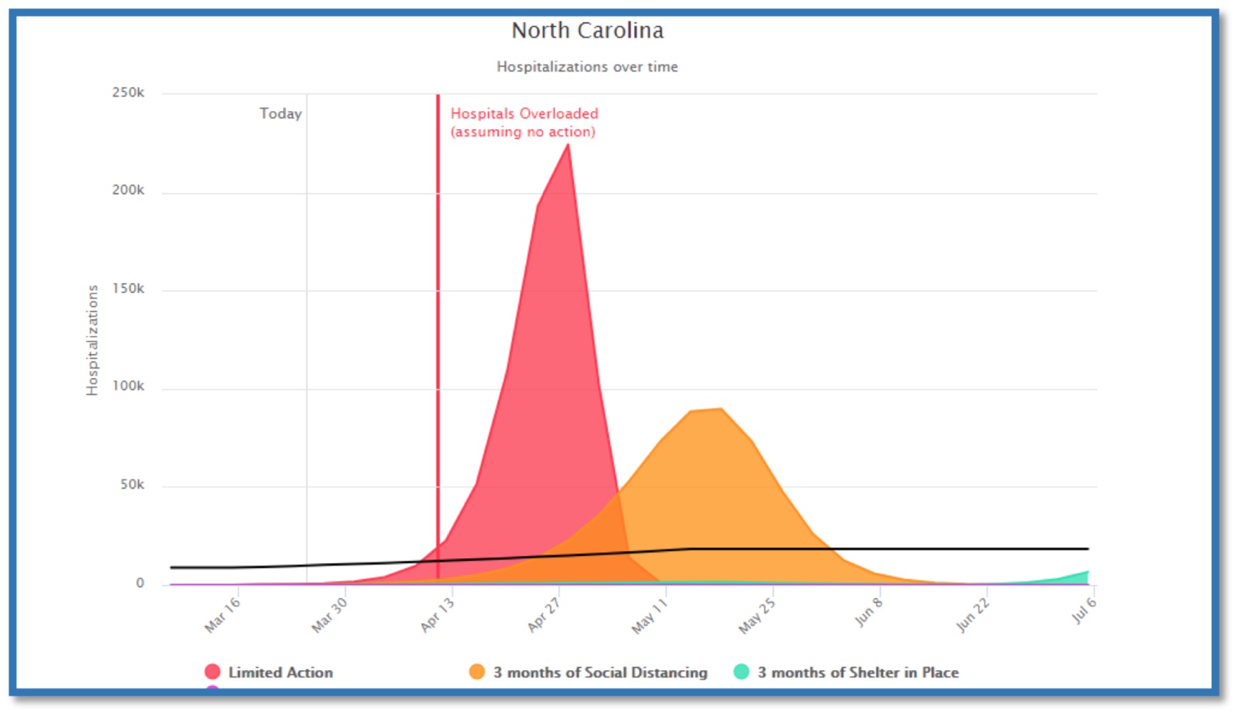
Here is what Raynor said about it:
This timeline is not 100 percent, but what it’s meant to show you is that if we do minimal action — here is the hospital bed capacity, approximately 25,000 beds in North Carolina, approximately 3,500 ICU beds in North Carolina … we are getting more ventilators, so I don’t know how many ventilator are available now but we can assume it’s going to be far less than 20,000.
So this black line here shows the capacity. The red peak shows if we did minimal action. So, sort of social distancing, but prior to last week, there wasn’t really much of that happening, and you can see the timeline is very short from the end of this month until middle of April, where we would way exceed capacity.
The second curve is generally just do social distancing. It’s a longer time till we hit the capacity and exceed it, but we still will exceed capacity.
And then the shelter-in-place, which is sort of an extreme measure of stay-at-home measures that have been placed in some of our counties, you can see that the availability of the health care system to provide care is extended out a lot further.
I expect with the stay-at-home we’re going to be somewhere in the middle of the orange and the light blue curves, but you can really see by the graphic what is meant by exceeding capacity, and the problem is then, if we don’t have the capacity to take care of the COVID patients, we won’t have the capacity to take care of all the other patients that also will need help for the other, unrelated problems.
To recap, here are the graph features — and where we are as of June 18:
- Dark black line: Hospital bed capacity, “approximately 25,000”
- Red peak: The “minimal action” projection: hospitals overwhelmed by an order of magnitude, approximately 225,000 hospitalizations by the peak in late April
- Orange peak: The “social distancing” projection: hospitals overwhelmed by a much smaller magnitude, approximately 90,000 hospitalizations by the peak in mid-May
- Blue peak: The “stay-at-home” projection: hospitals never overwhelmed, approximately 12,000 hospitalizations by the peak in early July
- June 18: Real-time data as of June 18, after recording the 10th record number of hospitalizations this month: 857 hospitalizations
If I were to update the chart for today, here’s how that would look:
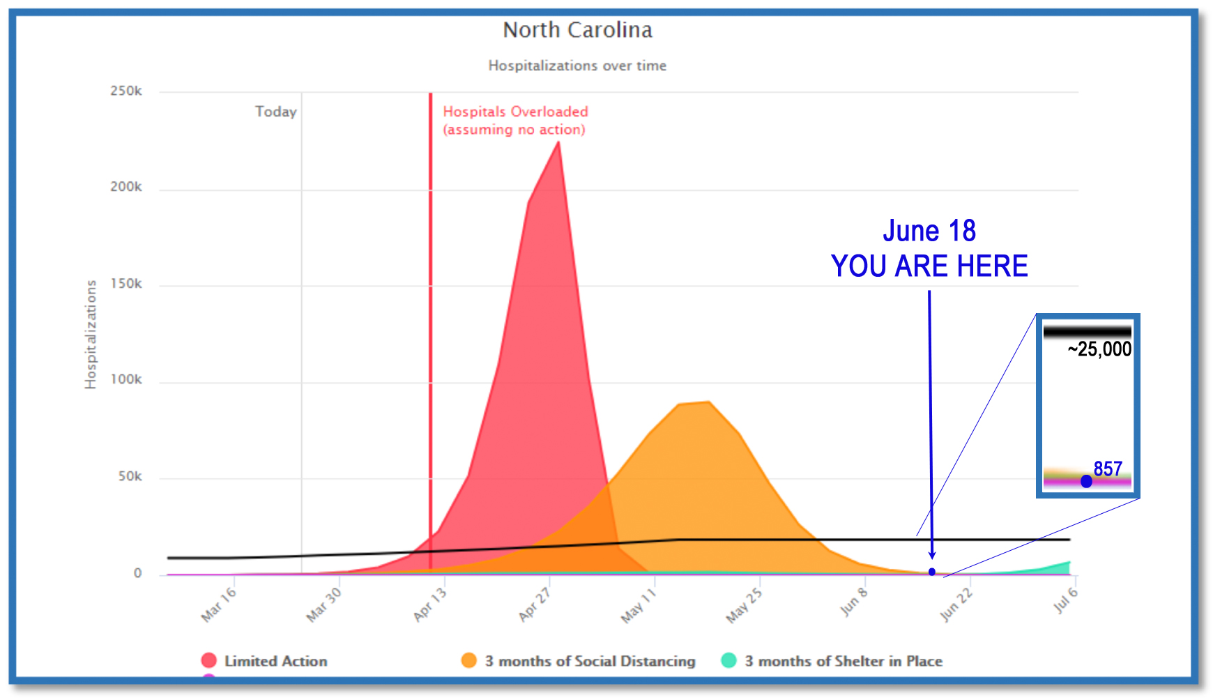
(Note that it’s hard to distinguish 857 below a black line that goes to 25,000, let alone on a chart that goes all the way to 250,000.)
Reporting hospitalizations without context spreads fear
In short, while hospitalizations from COVID-19 are still increasing, they are nowhere even close to the levels we worried about in March.
Furthermore, the fact that hospitalizations are increasing now is by design. It’s not some terrifying aberration signifying a coming “red peak” if we don’t immediately shut down everything all over again and force people into masks this time.
The hospitalization numbers need to be given in context. They’re far lower than we feared, and they’re rising now because that was the desired outcome of flattening the curve.
By highlighting rising hospitalizations out of context, the Cooper administration is needlessly scaring people. Why?
For more information, see:
We have flattened the curve, so why do NC businesses have to sue to open back up?