There has been a lot of chatter about spikes in COVID-19 infections. The North Carolina media is maintaining a somewhat constant reporting of the numbers with very little discussion of what they mean or what the trends really are. The national press does a better job of putting North Carolina’s numbers in context. For example, CNN lists North Carolina as one of 10 states that are “holding at a steady pace.” CNN is correct, and our state and local media have done little more than confuse and mislead the public.
Let’s look at the available data. Here are the number of daily tests performed in NC along with the number of (positives) cases of COVID-19:
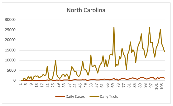
The above graph shows that the total number of tests performed in North Carolina has been increasing. While we still lag New York, inexplicably, in performing tests, it is clear that as the number of tests goes up, so too does the number of (positive) cases increase. North Carolina Department of Health and Human Services (NC DHHS) officials do not recommend “simply” dividing the number of cases by total tests due to reporting inconsistencies. To take into account reporting hiccups, one can look at the seven-day average for the ratio of positives to total tests, as I do here:
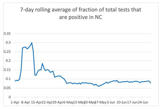
There is certainly no spike forming. This is why CNN placed North Carolina is in the “steady pace” category, while 25 other states have shown spikes. NC does not appear to be headed in the wrong direction.
But what about hospitalizations? Remember, the graph above simply says the ratio is constant or decreasing, but there are still more cases being found (due to the administration of more tests). Some of those cases require hospitalization, and so hospitalizations are going up too. The importance of tracking hospitalizations has always been to ensure that our health care system does not become overrun. This was the idea of “flattening the curve,” although the Cooper administration has sometimes lost sight of this goal.
NC DHHS does not report hospitalizations to the COVID-19 tracking project, so the numbers used come from their online data dashboard. If we look at the number of hospitalizations as a fraction of total positives, that is, the fraction of the population that tested positive and are hospitalized, here is the result:
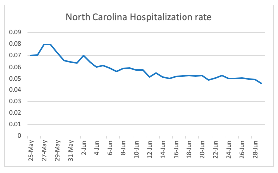
Remembering that the total hospitalizations are going up, the ratio of positives going to the hospital has actually dropped more than 40% since May 27. This could be due to the virus losing some of its potency, which has been reported. It could be that more young people are getting infected (through protesting, rioting, or otherwise having fun in the sun) and are less likely to need hospital care. Whatever the reason, this trend is significant, as it would suggest that hospital capacity is safer than if this rate had remained constant. Currently, there are some 6,000 hospital available beds and about 800 COVID patients in hospitals now.
What about the death rate, which is the most serious of all metrics?
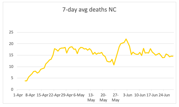
The death rate is a lagging indicator, but it has been remarkably constant. North Carolina ranks last in the country for reporting excess deaths to the Centers for Disease Control, which is the only reliable way of tracking COVID-19 deaths. So, the NC DHHS numbers should be taken with a grain of salt. Nevertheless, even using their numbers, there is no evidence of a spike.
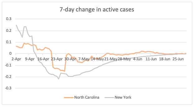
Finally, if you look at active cases normalized to a constant number of tests per day, the number of active cases is not going up at all (other than due to more tests being performed). This is convincing proof of the constancy of North Carolina’s infection rate.
NC is compared with New York in the graph below. Currently, both states are at zero. This means that if the same number of tests were performed every day, then the number of new cases would equal the number of recovered cases. No net increase is observed.
Curiously, North Carolina seems to be lagging New York so dramatically in the total number of tests taken. Correcting for the difference in populations, the following graph compares the number of total tests performed in the two states:
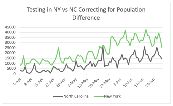
It is not clear why North Carolina is so far behind. The fraction of deaths occurring in North Carolina’s congregate living facilities is also among the highest in the country. Data from those facilities have been difficult to obtain while testing is lagging at these facilities.
To summarize, CNN is correct. North Carolina does not show any signs of a spike. The narrative from the Cooper administration is consistently devoid of science and data. There is certainly very little to base a prolongation of current restrictions.