- The Princeton Gerrymandering Project purports to measure gerrymandering objectively
- The PGP’s measure of gerrymandering is not based on any objective standard but the analysts’ opinion and preferences, however
- In nearly every state congressional map they have graded so far, their opinion is more favorable to Democrats than objective measures of gerrymandering are
I have noticed that some commenters and media outlets have been publicizing the Princeton Gerrymandering Project’s (PGP) grading of proposed congressional districts. While the PGP has lots of numbers on their web page, the prime determinant of their grades is not based on mathematical measures but their opinions.
A Good Start, But Then Bias Overrules Objective Measures
PGP analysts use mathematical methods for most measurements. They start by using an algorithm to create up to 1,000,000 maps that they claim “strictly follow traditional redistricting criteria” such as compactness, equal population, and minimalizing county splits.
They then compare state redistricting plans to the ensemble of maps they drew utilizing the algorithm. For example, they use a percentile ranking of a states’ map on Reock scores of “compactness” (North Carolina uses Polsby-Popper to calculate compactness, which produces a similar result) compared to their maps. If the districts of a map they grade are more compact than 95% of their computer-generated maps, they give the map an “A.” They give a “C” to maps between the 95th and 5th percentiles and an “F” to maps below the 5th percentile.
They similarly rank districts’ “county-splitting” and “competitiveness” by comparing them to the project’s computer-generated maps.
So far, so good.
Then the PGP analysts get to the category of “frequency of Democratic wins,” and things fall apart.
They start on the right foot by using their ensemble of maps to grade maps based on whether the number of likely Democratic seats in the map is within the 5th and 95th percentile of the distribution of their ensemble of maps’ seat shares. As we will see, maps that favor Republicans 9-5, maps that favor Republicans 8-6, and maps with a 7-7 split are all within that range. (For the sake of argument, I will assume that their methodology is correct, that it is an appropriate measure of the proper distribution of seats, and that there are no biases in the algorithm they used to draw districts. APRIL 2022 UPDATE: Due to allegations that PGP lead Sam Wang was manipulating data to favor Democrats, I am no longer willing to hold that assumption.)
The problem is that their ensemble range is not their primary measure of “partisan fairness.” In their own words, their primary measure for that category is “an aspirational view of fairness” (emphasis added). They “take the normative stance” (an academic way of saying it is their opinion) that Democrats and Republicans “should be treated symmetrically.”
While the ensemble method accounts for a state’s political geography, their “aspirational view of fairness” does not. This view (“aspirational” means a strong desire for something) introduces analysts’ personal biases and preferences into their map grades.
To make matters worse, by their own admission, their arbitrary “aspirational view of fairness” carries more weight than any of the objective measures they employ:
Our partisan fairness category is the most robust in detecting gerrymandering harms, so our final grade is heavily influenced by the partisan fairness grade with the other categories making grade adjustments. Specifically, we start with partisan fairness grade as our base final report card grade.
Again, the PGP’s supposed “detecting gerrymandering harms” is not done by any objective measure, but by their “normative stance” based on their preferences.
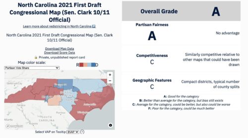
Princeton Gerrymandering Project’s Biased Assessment of North Carolina Congressional Districts
Let’s compare the PGP’s grades for two congressional maps the General Assembly is considering. The first is CBA-2, written by Rep Destin Hall (R-Caldwell). The second is CBK-4, written by Sen. Ben Clark (D-Cumberland, Hoke).
Both maps score a “C” for competitiveness, county splits, and compactness. Both are also within the 5th and 95th percentile of the distribution of seat shares on the PGP’s ensemble of maps (Hall’s is 9-5 Republican and Clark’s is 7-7). So, by all the mathematical measures, those two maps should have the same score.
But they do not.
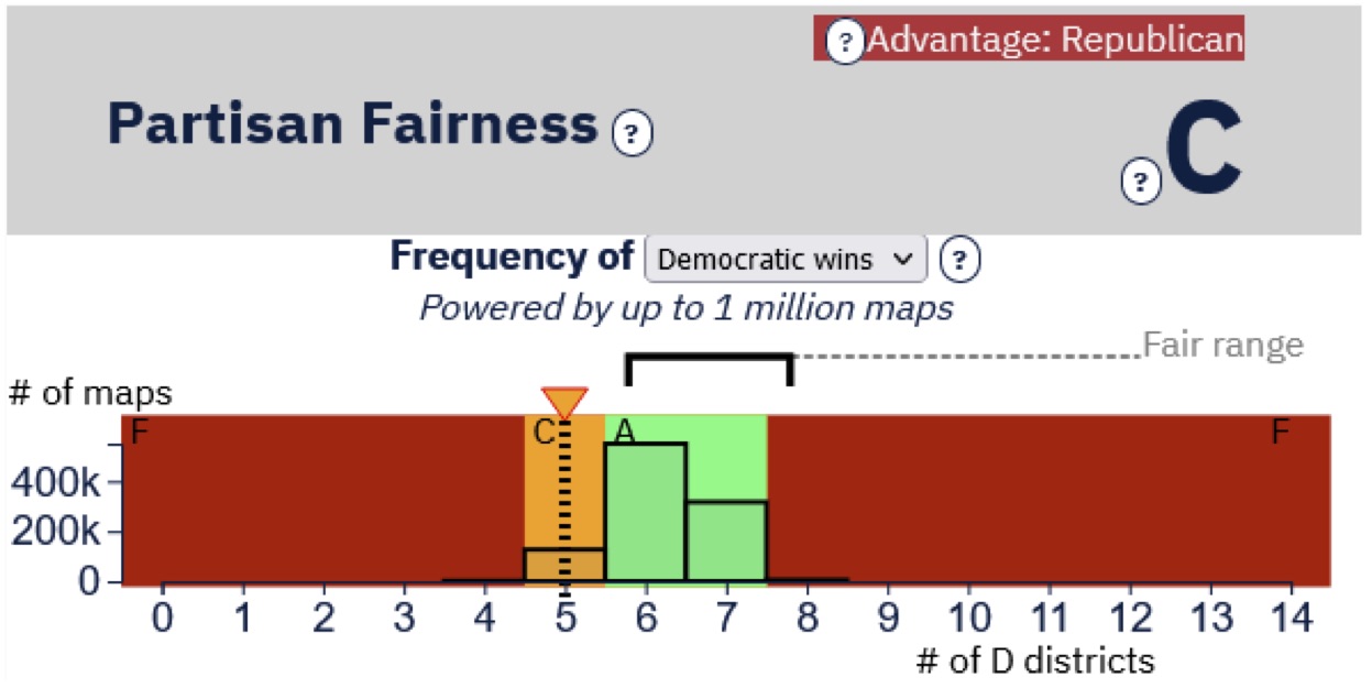
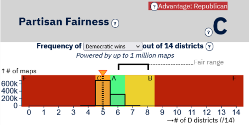
They grade Hall’s map (see Figure 1) “C” and Clark’s map (see Figure 2) “A.” The only difference between the maps is that the folks at the Princeton Gerrymandering Project put their thumbs on the scale with their “aspirational view of fairness.”
All the following charts come directly from the PGP’s web page. The numbers at the bottom of the graph indicate the number of likely Democratic seats. The bars represent the number of times a particular number of Democratic seats occurred in their ensemble of maps, and the “Fair Range” is based on their arbitrary “aspirational view of fairness.”
Figure 1: Princeton Gerrymandering Project’s grade of Rep. Destin Hall’s proposed congressional map
Again, it is only on the measure based on the opinion of the people at the Princeton Gerrymandering Project that Clark’s map is scored differently.
Figure 2: Princeton Gerrymandering Project’s grade of Sen. Ben Clark’s proposed congressional map
Well, maybe Hall’s map got a “C” because it was the third most common outcome, in term of likely Democratic wins, in the PGP’s ensemble of maps.
No.
Figure 3 is PGP’s grade of a proposed congressional map in Georgia. They graded the most common number of Democratic seats (five) a “C,” while the second most likely outcome, which is more favorable to Democrats (six seats), is graded “A.” Their “B” grade includes an outcome (eight Democratic seats) that is not within the 5th and 95th percentile of the distribution of seat shares of their ensemble of maps.
Figure 3: Princeton Gerrymandering Project’s grade of Georgia’s legislative staff-written congressional map
Of the twelve congressional map grading schemes PGP analysts have produced as of November 1, eight (including North Carolina and Georgia) are biased toward Democrats. The others include:
There are exceptions. PGP’s grading schemes in Oregon, Maryland, and Utah are not biased, and their Ohio grading scheme is biased in favor of Republicans. Overall, their “normative stance” favors Democrats, however.
Objective data assessments are not the driving force behind the Princeton Gerrymandering Project’s grading schemes of congressional maps, but their arbitrary “aspirational view of fairness” is.